May 20, 2021
Just How Important Is Your Logo?
Just how important is that graphic identity of your college, university, or school? We are asked this question often by clients. It turns out that it is very important, but for reasons you might not really consider. Here are four reasons why we think a strong graphic identity is critical to favorably positioning your institution in the minds of constituencies, and some of the pitfalls that schools and colleges fall into along the way.
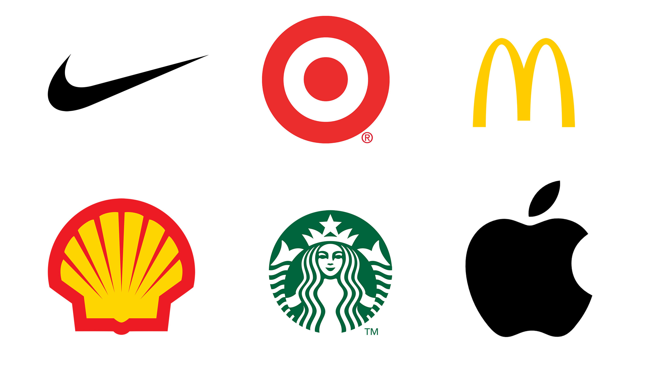
Consistency – Visit 150 campuses and you will find 1500 logos. It it hard to gain traction around any common market position if your own school or college confuses the brand by having different graphic identities. This is perhaps the most common pitfall we see in the industry. Walk into any school bookstore and you might find five different versions of the school logo, seal, or athletic mark. Think about the Nike “swoosh” or the McDonald’s “M”: they never deviate from their look. Consistency is critical.
Purpose – It is similarly important to use the right mark for the right purpose. At most, schools and colleges should have three marks: (1) a main promotional logo to be used informally on 90% of print and electronic media, (2) a seal, which is the mark of authenticity of an institution, to be used on transcripts and formal documents (not on the side of a physical plant van), and (3) an athletic mark, which is used only for athletics and does not need to have ten different variations for each sport. A common pitfall we see is that schools and colleges will use their seal for promotional purposes. Bad idea.
Persona – A great icon needs to communicate something endearing, purposeful about your organization. It needs to tell a story, rather than just be a clever mark. Our “lighthouse” logo is important for ISA in two ways for storytelling: (1) it places us on the west coast where there are lots of lighthouses, and (2) lighthouses help steer in the proper direction and away from missteps in turbulent times. That’s what ISA does with strategy.
The 70 Mile an Hour Test – A great icon needs to be discernible, even when driving past a billboard at 70 miles an hour. I once heard a researcher say that the three most recognizable icons in the world were the McDonald’s “M”, the Nike “swoosh”, and the cross of the crucifix. What do they all have in common? They are absolutely simple.
I think graphic identities are the foundation of a strong promotional agenda. Not because they are cool, clever, or faddish. No, because they actually communicate something really important. They tell a story. And, we all know people love a story.
A picture says more than a thousand words.